
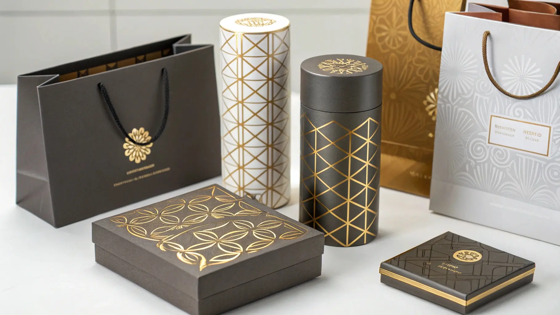
Your packaging looks flat and fails to grab attention. This simple technique adds a touch of luxury and texture that customers can immediately feel, making your brand instantly more memorable.
Embossing creates a raised, 3D design on the surface of your packaging. Debossing creates a recessed, sunken design. Both methods add a premium, tactile dimension to your product without using any ink, relying on pressure and precision to elevate your brand’s perceived value.

These techniques might seem straightforward, but the difference between a stunning result and a costly mistake lies in the details. As a packaging manufacturer, I’ve seen it all. Let’s break down what you really need to know to make these powerful tools work for your brand.
What is embossing on packaging?
Is your standard printed box getting lost on the shelf? Embossing adds a 3D effect that physically elevates your brand’s feel, making it instantly more premium and interesting.
Embossing is a finishing process that creates a raised, three-dimensional image on paper or cardstock. It uses a custom metal die and a counter-die to press the material from underneath. This pressure permanently pushes the design upwards, adding a sophisticated, tactile quality to logos or patterns.
The idea of pressing a design into paper sounds simple, but the execution requires a deep understanding of materials and machinery. The final effect depends on three key factors: the die, the paper, and the press operator’s skill. A beautiful design on paper can easily become a production nightmare if these elements aren’t perfectly aligned.
The Art of the Die
The heart of the embossing process is the die. Its cost and complexity can vary wildly. A simple, single-level design might use a relatively inexpensive brass die. However, I’ve seen designers present concepts for highly detailed, multi-level crests that require a hand-tooled steel die. These complex dies can cost thousands of dollars, sometimes eating up the entire finishing budget before a single box is made. It’s a classic case of the design cart pulling the production horse. It’s crucial to match the die complexity to the project budget.
| Die Type | Material | Complexity | Cost | Best For |
|---|---|---|---|---|
| Single-Level | Brass/Magnesium | Low | $ | Simple logos, text |
| Multi-Level | Brass | Medium | $$ | Designs with varied depth |
| Hand-Tooled | Steel/Copper | High | $$$$ | Highly detailed, sculptural art |
Paper Choice is Crucial
Not all paper is created equal, especially under pressure. I once saw a project fail because the design called for a deep, sharp emboss on a recycled paper stock. The client loved the sustainable material, but didn’t understand its limitations. On the press, the short fibers of the recycled paper tore consistently along the stress lines. We learned the hard way that for a deep emboss, you need paper with long, flexible virgin fibers that can stretch without breaking. The material’s integrity is the ultimate gatekeeper of a design’s feasibility.
The Myth of the Reverse Impression
There’s a persistent myth that embossing always leaves a heavy impression, or "bruising," on the reverse side of the paper. While this is often true, a highly skilled press operator can minimize it. For a luxury perfume box, we once spent a full day testing pressures and using a custom, softer counter-die. We managed to get a crisp emboss on the outside with an almost invisible mark on the inside—a detail the client believed was impossible. It takes expertise, but it can be done.
What is the difference between debossing and embossing?
You know you want a 3D effect, but should your design be raised or indented? Choosing between embossing and debossing seems simple, but each creates a very different feeling.
The key difference is direction. Embossing creates a raised pattern by pressing the paper up from behind. Debossing creates a sunken pattern by stamping the paper down from the front. Embossing protrudes for a pronounced look, while debossing creates a subtle, elegant indentation.
The choice between pushing the design up or pressing it down goes beyond just looks. It affects how the packaging feels, how it holds up during shipping, and even how it can be used functionally. I’ve seen both techniques used brilliantly, and I’ve also seen them cause unexpected problems when not thought through.
Visual and Tactile Feel
Embossing makes a design pop out, catching light and shadow to draw the eye. It feels prominent and assertive. Debossing, on the other hand, is more subtle and understated. It invites you to touch it, creating a sense of quality and craftsmanship. However, these effects come with practical considerations. I worked on a project for a high-end electronics brand where a debossed logo on a gift box was combined with a soft-touch laminate. During transit, the slightly abrasive shipping boxes were scuffing the raised edges of the laminate around the debossed area. The "premium" feature became a quality control nightmare. We learned that a deboss can create hard edges that are vulnerable to abrasion, a detail often overlooked in the design phase.
| Feature | Embossing (Raised) | Debossing (Sunken) |
|---|---|---|
| Visual Effect | Pops out, catches light | Subtle, creates shadow |
| Tactile Feel | Pronounced, bold | Understated, elegant |
| Best For | Logos, hero graphics | Fine text, subtle patterns |
| Potential Issue | Can get crushed/flattened | Can scuff on raised edges |
Functional Applications
While we usually think of these techniques for aesthetics, they can also be functional. One of the most clever applications I’ve seen wasn’t for decoration at all. A food packaging company used a subtle, debossed channel near the tear-off strip of a sealed package. This channel weakened the material just enough to ensure a perfectly straight, clean tear every time. It was a purely functional deboss that dramatically improved the user experience. This proves the technique is not just for making things look good; it can also make them work better.
What is the embossing effect in packaging?
Is your packaging just a container, or is it part of the experience? The embossing effect transforms a simple box into a memorable tactile interaction that signals quality and value.
The embossing effect adds perceived value and a luxury feel to any package. It engages the sense of touch, making the product more memorable and desirable. This technique can highlight a logo, create intricate patterns, or add texture, making your product stand out from competitors.
The feeling of a raised surface under your fingertips creates a powerful, non-verbal message about your brand. It says you care about the details. However, an interesting paradox I’ve observed is that while good embossing feels premium, poorly executed embossing makes a product look cheaper than if it had no special finish at all.
The Perception of Quality
A fuzzy, ill-defined, or cracked emboss screams "low quality." It tells the customer that corners were cut. In contrast, a simple, clean, blind deboss (an indentation without ink or foil) often communicates more confidence and elegance than a complex, multi-level emboss. Sometimes, the quietest statement is the most powerful one. The goal is to enhance the brand, not to show off a technique. The effect should feel intentional and perfectly executed to achieve that premium perception.
| Emboss Quality | Customer Perception | Brand Image |
|---|---|---|
| Crisp, Deep, Clean | Premium, high-quality, detailed | Luxury, trustworthy, confident |
| Soft, Rounded | Elegant, subtle, sophisticated | Modern, approachable |
| Fuzzy, Cracked, Shallow | Cheap, rushed, low-quality | Budget, untrustworthy |
Technical Details: Depth and Shoulder
People often assume a deeper emboss is always better, but that’s not true. The "shoulder" of the embossed image—the angle of the sloped sides—is just as important as the depth. A die with a sharp, steep shoulder is aggressive and much more likely to cut or crack the paper fibers. I’ve found that a slightly softer, more rounded shoulder often gives the impression of greater depth and sophistication. It’s also far more forgiving on a wider range of paper stocks, reducing the risk of failure during production and delivering a cleaner final product. Getting this detail right is a sign of a truly professional job.
What is the process of embossing and debossing?
Thinking about adding a 3D effect to your packaging design? The process can seem technical, but understanding the key steps from die to press can prevent costly mistakes.
The process involves first creating a custom metal die of your design. For embossing, the paper is placed between this die and a matching counter-die, and pressure is applied. For debossing, the paper is simply pressed down from the front into the indented die.
From a designer’s file to a finished, tactile box, several critical steps must be managed perfectly. A mistake at any stage can ruin the entire batch. Collaboration and communication between the designer, the die maker, and the press operator are not just helpful; they are essential for success.
From Design to Die
I’ve noticed that the most successful projects are those where the designer collaborates with the die maker from the very beginning. A designer might create a beautiful, intricate graphic on a screen. But a skilled die maker will know that thinning a specific line by a fraction of a millimeter or softening a sharp corner will make the difference between a clean impression and a muddled failure. The real artistry is in translating a visual design into a mechanically viable tool that works with real-world materials.
The Pressing Issue: Registration
A common point of failure is "registration," which is the alignment of the emboss with any printed artwork or foil. I recall a whiskey label project where a beautiful gold foil crest was to be embossed. The initial run had a tiny 0.5mm misalignment, which made the entire batch look cheap and misprinted. The issue was traced back to the paper stock stretching ever so slightly after the heat of the foil stamping was applied. The solution was to let the sheets acclimate and stabilize for 24 hours between the two processes. It’s a small detail that makes a huge difference.
| Step | Action | Key Consideration |
|---|---|---|
| 1. Design | Create digital artwork. | Collaborate with die maker on feasibility. |
| 2. Die Making | Etch or tool the design into metal. | Choose the right material and shoulder angle. |
| 3. Printing (Optional) | Print ink or apply foil to the paper. | Allow paper to acclimate to prevent stretch. |
| 4. Press Setup | Mount the die and align the paper. | Perfect registration is critical. |
| 5. Stamping | Apply heat and pressure. | Adjust pressure and dwell time for the stock. |
Beyond Paper: Other Materials
While most think of paper, these techniques can be applied to other materials. I once consulted on a project involving debossing a logo onto a dense, felt-like material made from recycled textiles for a car interior. The challenge wasn’t the pressure, but the material’s "memory"—it would slowly spring back after being compressed. We had to experiment with a heated die and a longer "dwell time," which means holding the pressure for a few extra seconds, to permanently set the impression.
Conclusion
Embossing and debossing are powerful tools in packaging. They turn a simple container into a tactile experience, but success lies in understanding the details and working with an experienced partner.
